Saturday, March 22, 2014

Easy Visualizations of PHPP Energy Performance With A Sketchup Ruby Script

Cooling-Period Losses & Gains (kWh)


We're always on the lookout for new ways to work with our tools and get them to interact better with one another. Like most designers, we can often use 5 or 10 different pieces of software for any given job. Two of our favorites are PHPP (the Passive House Planning Package Energy modeling software) and Sketchup - the simple 3D Modeler. While we certainly love the 3DMaxe-s and V-Ray-s of the world, Sketchup has a definite place in our workflow,, especially when it comes to the diagram. The simple line-work and flexibility of the modeler make Sketchup a great tool for simple 3D diagrams.

Recently we've begun working with Ruby to interact with Sketchup a bit more. I caution you - we're in no ways experts in (or even all that good at) Ruby, but we thought we'd post a bit about one of our recent tools we made. This script uses Ruby to import values, calculated in the PHPP Energy Modeling software, and then apply them as attributes to 3D Geometry in Sketchup.

This, of course, will probably all be entirely obsolete as soon as they release the PHPP Sketchup tool DesignPH (though who knows when that will ever happen in the US ..... ) But for now this is a nice way to perform both data verification (by using color to spot abnormalities and errors) and to display information to clients and others working on the project.

PHPP is an incredibly robust energy modeling package, but of course its completely devoid of any graphical content save for a couple little graphs and a chart or two buried in there. While you engineers out there might love that kind of thing, those of us on the more architect-y end of the spectrum can have a tough time with nothing but page after page of numbers. Its also often difficult to translate this data into something meaningful for our clients or design-partners. 

recently, out of necessity we built a pair of Ruby scripts which can take some of this mush of data and bring it into Sketchup. The image at the top of this post shows you the kind of thing we're after - using visuals to more intuitively show energy performance in a flexible way which allows us to move quickly through multiple versions and options. 

So  - how does it work?

First, the data in PHPP needs to be consolidated into an export sheet. While the 'Windows' sheet does a decent enough job giving some info about the window performance - we actually like to get a finer grain of feedback separately for the heating (winter) and cooling (summer) periods for our analysis. 

The image below is from one of our custom sheets from a recent project - its mostly all reporting from different locations within PHPP (sort of), but collected in one place so we can more effectively assess the window performance. 

Custom sheet Heating Period Reporting Table

Once you set this up for the heating and cooling periods, you can pull out whatever data your interested in. In this case, its the Window Heating and Cooling Period's Net Gain (or Loss) values. These are exported to a simple CSV file which is what we use to move data into Sketchup.

CSV of the Data we want to bring into Sketchup - these numbers are all kWh / period

Ok - so far pretty easy right? Its just messing around in Excel really. So now that you have the CSV, we move to Ruby. We are still learning Ruby - so please don't yell at us if (when) you see us doing something not quite right.

The Sketchup workflow actually has two scripts - one which imports data, and the other which colors elements

First, we select the PHPP CSV Importer  tool from the plugins menu...


Next enter the path for the CSV file you just saved out from the PHPP Excel model.

Enter the CSV columns for the data types you are importing (column 1 in the CSV is column 0 in the ruby here) - yes, this is all pretty User-Unfriendly - you need to know a lot about how the data is set up before this can work - I'll build it out so its nicer to work with . . . someday. . .


This now takes the data and applies it to the model. It basically looks around at the objects and matches the names of the objects in the Sketchup model with the Names on the CSV list. The code looks like this:

mod = Sketchup.active_model # Open model
ent = mod.entities # All entities in model
sel = mod.selection # Current selection

#This is the Method to call for importing data
def PHPP_CSV_Importer.assignAttribute(imported_array, column, attrib_name)
      mod = Sketchup.active_model # Open model
      ent = mod.entities # All entities in model
      sel = mod.selection # Current selection
      _imported_data_array = imported_array
      _column = column  
      _attrib_name = attrib_name
      
      #This part ‘clears’ all the existing attribute values
      ent.each do |e|
        e.set_attribute("dynamic_attributes", _attrib_name, 0)
      end
           
      #This part steps through every Entity (in Ruby, all Sketchup objects are called 'Entities'
      ent.each do |e|
        entName = e.get_attribute("dynamic_attributes", "_name")
        limit = _imported_data_array.length
        i = 0
        j = 0
        
          for counter in 0..limit-1
            if entName == _imported_data_array[j][0]
              _importedValue = _imported_data_array[j][_column]
              e.set_attribute("dynamic_attributes", _attrib_name, _importedValue.chomp.to_i )
              j+=1
            else
              j+=1
            end
          end 
        
      end
      
    end
    
    #Below this is what runs when you select from the PLUGINS menu
    #This part is to get the file location and Columns for import
    prompts = ["File Location", "Heating Col.", "Cooling Col.", "Yearly Col."]
    defaults = ["/Users/edwinmay/Desktop/Workbook1.csv", "1", "2", "3"]
    inputValue = UI.inputbox(prompts, defaults, "File to Import")
    heatingCSVcolumn = inputValue[1].chomp.to_i
    coolingCSVcolumn = inputValue[2].chomp.to_i
    yearlyCSVcolumn = inputValue[3].chomp.to_i
      
    
    #This part tells where the file to read is
    fname = "/Users/edwinmay/Desktop/Workbook1.csv" #inputValue[0]
    f = File.new(fname, "r");
    lines = f.readlines(); #This makes an array of each line - each line is a string
    f.close();

    #This part splits the imported file(array) into a 2D array at the commas
    imported_data_array = []
    lines.each { |r|
      line_array = []
      line_array = r.split(',')
      imported_data_array << line_array
      }

###########
# Main body of the Program - definition calls
###########    
    assignAttribute(imported_data_array, heatingCSVcolumn, "summernet")
    assignAttribute(imported_data_array, coolingCSVcolumn, "winternet")
    assignAttribute(imported_data_array, yearlyCSVcolumn, "yearnet")
  end
end


As you can see, this will make attributes and apply the imported values. So far so good right? But still no colors yet. But f you look at any of the window objects you'll see that the values have been applied.

Attributes from PHPP applied to the 3D Geometry as an attribute

So, if you select the windows or elements you want to colorize, then select the PHPP Visualizer from the plugins menu, you should be prompted which period you want to see - simple select one and the colors will be applied and show up. You can run this as many times as you like and it will re-style everything accordingly.


Select the PHPP Visualizer Tool from the Menu

Select the Period you want to see represented

For those interested, the code for the Visualizer looks like this:

###########
# VARIABLES
###########
module PHPP_Vis
  def PHPP_Vis.main
    mod = Sketchup.active_model # Open model
    ent = mod.entities # All entities in model
    sel = mod.selection # Current selection
    maxCount = sel.count-1
    maxSumNetGains = 1810
    maxSumNetLosses = 330
    maxWintNetGains = 1070
    maxWintNetLosses = 400
    maxNetGains = 2870
    maxNetLosses = 640
    inputValue = []
    textArray = []

###########
# METHODS
###########
    #method for displaying the Summer Net Gains/Losses of selected entities
    def PHPP_Vis.displaySumNet(sumNetGains, sumNetLosses)
      mod = Sketchup.active_model
      maxNetGains = sumNetGains
      maxNetLosses = sumNetLosses
      sel = mod.selection
        sel.each do |e|
          netValue = e.get_attribute("dynamic_attributes", "summernet")
          if netValue > 0
            r = 255
            g = 255-(((netValue)*255) / maxNetGains)
            b = 255-(((netValue)*255) / maxNetGains)
          else
            r = 255+(((netValue)*255) / maxNetLosses)
            g = 255+(((netValue)*255) / maxNetLosses)
            b = 255
          end
          e.material = r,g,b
        end
    end
    
    #method for displaying the Winter Net Gains/Losses of selected entities
    def PHPP_Vis.displayWintNet(wintNetGains, wintNetLosses)
    mod = Sketchup.active_model
      maxNetGains = wintNetGains
      maxNetLosses = wintNetLosses
      sel = mod.selection
  
      sel.each do |e|
        netValue = e.get_attribute("dynamic_attributes", "winternet")
          if netValue > 0
            r = 255
            g = 255-(((netValue)*255) / maxNetGains)
            b = 255-(((netValue)*255) / maxNetGains)
        else
            r = 255+(((netValue)*255) / maxNetLosses)
            g = 255+(((netValue)*255) / maxNetLosses)
            b = 255
        end
      e.material = r,g,b
      end
    end 
    
    #method for displaying the Yearly Net Gains/Losses of selected entities
    def PHPP_Vis.displayNet(netGains, netLosses)
      mod = Sketchup.active_model
      maxNetGains = netGains
      maxNetLosses = netLosses
      sel = mod.selection
      
      sel.each do |e|
        netValue = e.get_attribute("dynamic_attributes", "yearnet")
        if netValue > 0
          r = 255
          g = 255-(((netValue)*255) / maxNetGains)
          b = 255-(((netValue)*255) / maxNetGains)
        else
          r = 255+(((netValue)*255) / maxNetLosses)
          g = 255+(((netValue)*255) / maxNetLosses)
          b = 255
        end
    e.material = r,g,b
      end
    end

    #method for displaying Attribute Value on the Selected Elements
    def PHPP_Vis.displayText(inputValue)
      mod = Sketchup.active_model
      ent = mod.entities
      sel = mod.selection
      _inputValue = inputValue
      
      #This part applies the attribute value to the face
      sel.each do |e|
        textToDisplay = e.get_attribute("dynamic_attributes", _inputValue)
        face = sel
        cntrPoint = e.bounds.center
        point = Geom::Point3d.new cntrPoint
        vector = Geom::Vector3d.new(10,10,10) #the 10,10,10 part should use the normal to ‘push'
        pointNew = point.offset! vector
        text = ent.add_text textToDisplay, point
      end
    end
      
    #This part ‘clears’ the material colors from the last run
    ent.each do |e|  
      e.material = 255,255,255 
    end  

    #Input Box def inPutBox
    prompts = ["Display"]    
    defaults = [" "]
    list = ["Summer Net|Winter Net|Yearly Net"]
    inputValue = UI.inputbox(prompts, defaults, list, "Display")
    
    #Main Body of the Program that calls functions to color faces
    _inputValue = inputValue[0]
    if _inputValue == "Summer Net"
      displaySumNet(maxSumNetGains, maxSumNetLosses)
      #displayText("summernet")
    elsif _inputValue == "Winter Net"
      displayWintNet(maxWintNetGains, maxWintNetLosses)
    elsif _inputValue == "Yearly Net" 
      displayNet(maxNetGains,maxNetLosses)
    end
  end
 end

As you can see, there a bunch of hard-coded elements that should be more flexible (things like adjusting the scale max and min, etc..) Maybe someday I'll get to it. For now I just change the code depending on the data coming in. Hasn't been a huge pain.... yet.

Mostly its pretty simple though - normalizes the value from the attribute and uses a color scale to select the color value in R,G and B - then applies that color to the face.


Colorized Windows and Doors based on values calculated in PHPP

It works pretty well and we've used it for the last couple projects. It could certainly use some 'making-nice', but it gives us the feedback we need for these kinds of projects. One side benefit is that you instantly note outliers / errors easily in this workflow because they visually stick out like a sore thumb. 

And while it may not seem like much when your looking at a single small house with 15 windows, once you get to the larger multifamily or commercial jobs tools like this become critical. We have one Passive House in the pipeline with 70+ windows and you wouldn't want to go applying data by hand every time you made a change.

If you think you have a better idea for the code or the procedures here let us know! We're always refining things and love to hear new ideas.


Tuesday, November 12, 2013

Making Of: Upstate NY House Rendering (Photoshop Part 01)

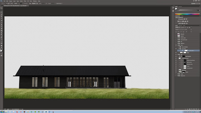
I thought I'd try something new here and post a detailed 'making of' for one of our newest visualizations we've been working on. Architectural Visualizations are something we spend a lot of time laboring over, and of course every designer has their own (usually very strong) opinions on what techniques are best for these types of drawings. We've been experimenting for a while now with using Vray and Photoshop techniques to get at a fairly 'painter-ly' aesthetic. Hopefully this Photoshop breakdown will be helpful to some and at least a bit interesting.

Here's the final rendering I'll be pulling apart:

Upstate NY house

01. Base Render and Color Corrections:

To begin with, I'm going to skip right over the entire 3-D modeling-to-Vray workflow; I'll get back to this in a future post. For now, I'd like to focus on our Photoshop standard box-o-tricks, many of which we deployed here. The initial Rendering was quite low-detail, and very simply lit with a Vray Dome-Light / HDRI in 3D Studio Max. I knew that for this shot I wanted soft, diffuse lighting as I would be adding a rainy Photoshop world in post-production. The home here is in upstate NY and much of the design has to do with providing shelter and protection from the (relatively) harsh climate - so we really wanted to play up this "sanctuary" feeling in the drawing with the lighting, entourage and environmental effects.

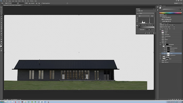
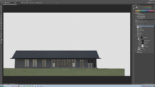
Raw Render - just enough to work with and nothing more

As you can see, the view chosen was quite straight-on, emphasizing the horizontality of the form and the large wall of windows. We intentionally did not choose a High-Field-of-View, angular, 'Architect-y' vantage point; the project is very simple, restrained and elegant in its form and straight-on shots seem to convey a slightly 'quieter' feeling here.

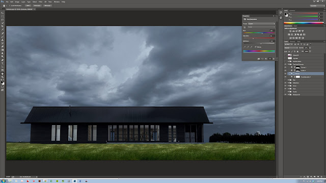
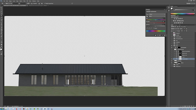
Hue-Saturation Adjustment Layer

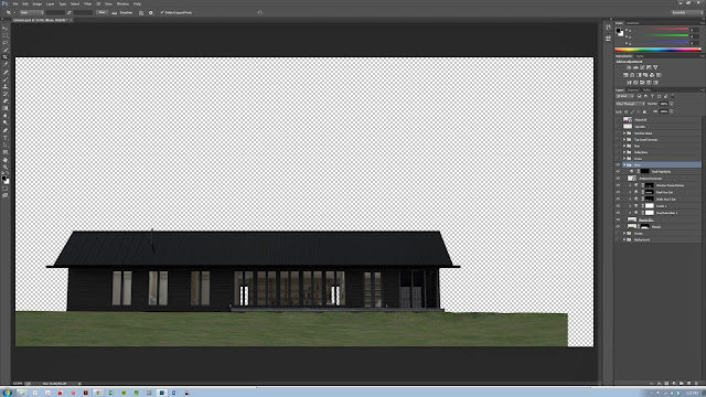
As much as possible we of course like to work with Photoshop Adjustment Layers to maintain as much flexibility as possible. My standard set of initial color corrections is almost always a Hue-Saturation Adjustment (to reduce saturation and adjust brightness), A Levels correction (crunch both the black and white) to bump up the contrast, and usually a Curves slight tweak. These three usually do a great job of 'popping' almost any image. Here, since we're going to do some more dramatic lighting later on, I darkened everything much more than I normally would in straight daylight shot.

Darken to get ready for the Lights later

Level Correction

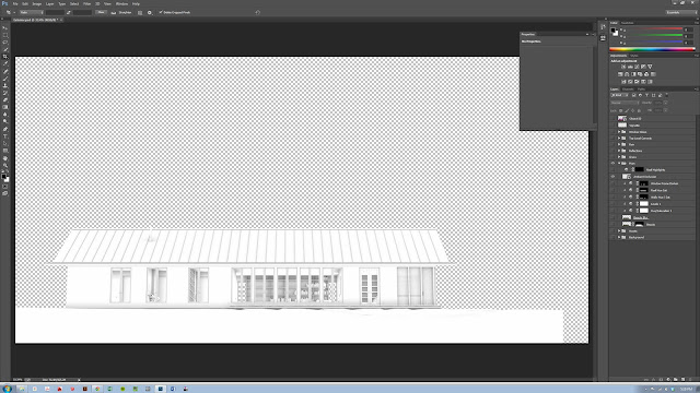
AO Render Pass
We used to output a huge bag of Render Passes from 3D Max with every render, but lately we've started being more strategic with our passes - for this simple image the Ambient Occlusion Pass was pretty much the only one we ended up using for this drawing. This layer is made in Vray and gives a great image which can be used to accentuate surface-contact and give some real weight to forms. If you simply apply a Multiply Blend-Mode to this layer you'll get great definition on all the edges in the scene. Then simply use the opacity to control how strong the effect is.

Final Color Corrected Base Render
That's pretty much it for the main house. As you can see, most of the real story-telling in the drawing is being done by the non-architecture elements; the environment, the entourage, and especially the lighting.

02. Grass and Foreground

The next step was to begin adding the environment, grass, people, trees, sky, etc. The grass here is from a simple internet search:

nice clean shot of grass.
This image was copied, flipped, pinched, prodded and generally-messed-with until I got a nice fully-grassy site for our house.

Grass Foreground Layer
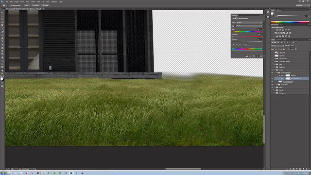
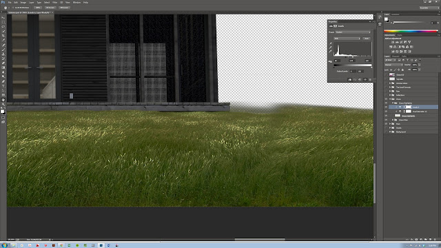
The grass, however, needs to look wet since we're going to add a rain effect later. To do this I duplicated the grass layer, and added two adjustment layers to get the highlights to pop: a De-Saturation to get a totally grey-scale image, and then a simple Level adjustment to really bring out the highlights. This method gives a very nice shiny-tip effect which worked well to give us the 'wet' effect.

Duplicate the layer and make B/W with the Saturation Adjustment Layer

Add a Level correction to pop those highlights to give the shiny, wet effect we're after

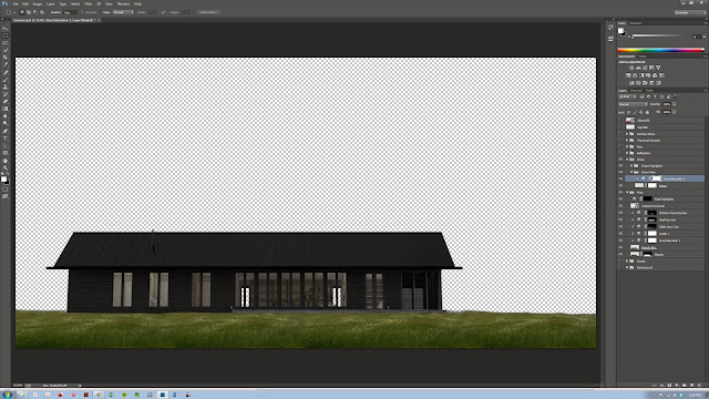
Grass Hue/Saturation Adjustment
And finally, a Hue-Saturation adjustment to correct the overall lighting level and bring it in line with our house.

03. Background:

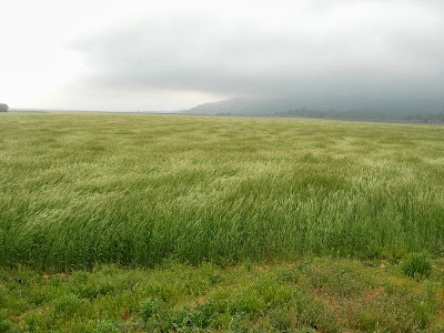
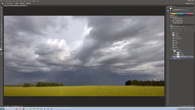
Next, the background was dropped in. Again, an internet search for images revealed lots of great images, but we chose this dramatic cloudy sky over a field:

Original background image, cropped
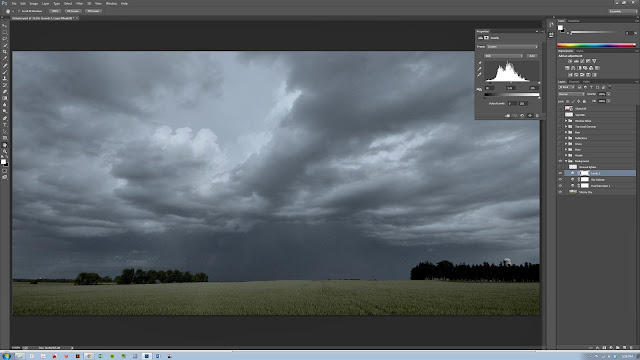
Aside from the usual color corrections, the main element here is the use of the 'Colorize' function within the Hue-Saturation adjustment layer. This adds a consistent hue adjustment to the entire image and can be used to add uniformity to the colors in an image. Typically, I like to add this adjustment and then reduce the adjustment layer's opacity in order to temper the effect. Here we gave everything a nice blue pall to give us a nighttime look that will work well with the rainy, cold feeling we're after.

Colorize using Hue-Saturation Adjustment Layer

Levels Correction

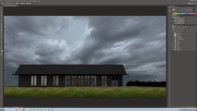
As you can see below, the final composite looks very dark, but that is intentional so that we can add in the lighting later. You can also see that the colors (the green, the yellow and the slate sky) are NOT working well together. We'll fix this in the next steps.

Final Foreground, Background and House composite

04-05-06 Reflections, Top-Level Color Corrections, Glows:

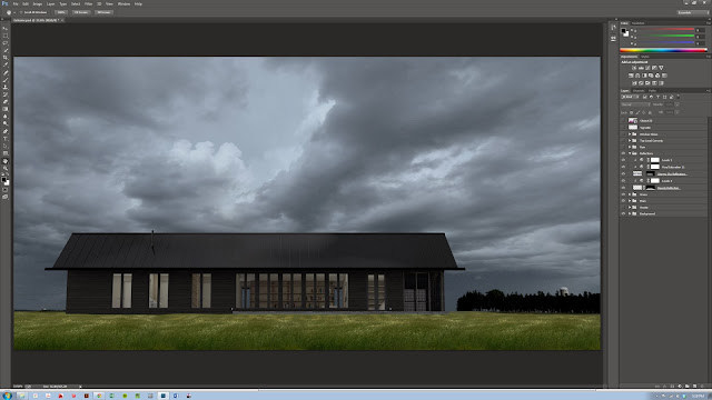
Here we added some painted on reflections (just bright splotches) to the grass, and more importantly we add a Hue-Saturation Colorization which affects the entire image file. As you can see, the Hue adjustment gives a strong cooling effect to the image - this layer is only at about 25% as well to make sure that some of the original hues come through in the grass, but still giving us a more uniform hue range.

04. Add painted reflections to the grass

05. Colorize to unify all the various colors a bit
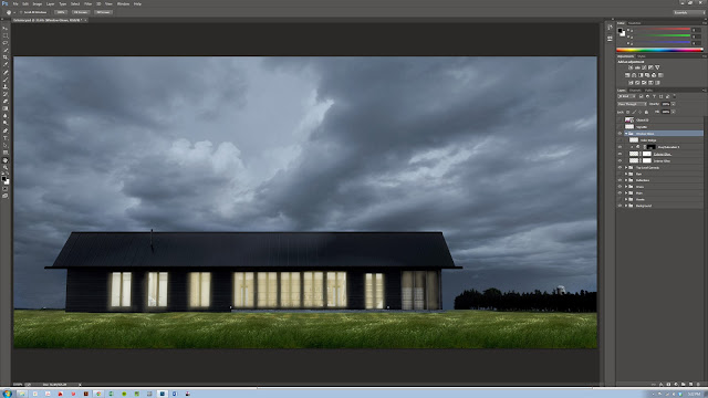
Here we also add a series of drawn-in glows for the windows. These effects might seem a bit harsh here but you'll see that behind the screen of rain we're going to add next they have to be pretty strong in order to show through well.

06. Painted on Window Glows

07. Rain:

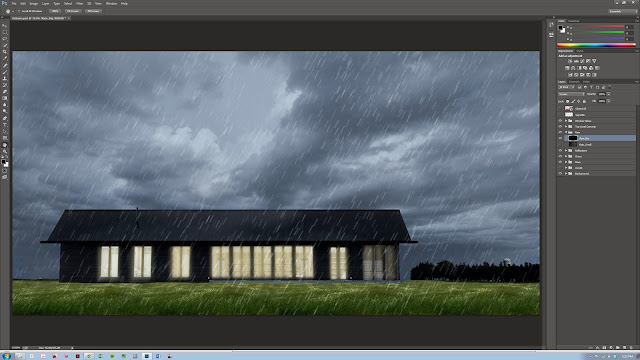
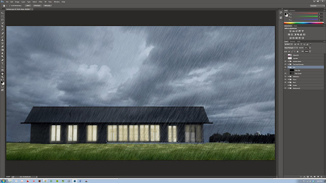
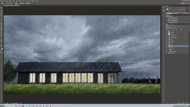
The rain effect was added entirely inside Photoshop and in two layers. The rain is done in two distinct layers with different size rain-drops in order to give some depth the scene. There are LOTS of great tutorials on how to produce this effect so I won't bore you with it again here. If you want to see a great tutorial on this, check out PSDTUTS here.

Rain Drops - Large
Rain Drops - Small

Rain Drops - Combined

08. Entourage:

Entourage is the name an old firm I worked for used to give to people, trees, foreground elements and other misc 'life' in scenes and it seems to have stuck in my rendering vocabulary. The scene here includes only a very few elements - just enough to establish the story and give some sense of depth to the world being illustrated.

Trees and People

The most important part here are the people of course. The mom (grandmom?) in her jaunty red raincoat here is perfect. This rendering is fairly low-res as its destined to web-only viewing so I didn't spend a lot of time messing with high-res people. Its important to be strategic with these images - no sense in wasting time unnecessarily after all. The lady here is another internet grab with shadow and highlights painted to correct the lighting:

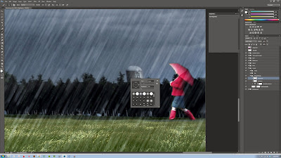
Initial image added to the scene

For small elements like this I just paint a quick image mask
rather than using the path tool to carefully trace.

Masked image

Next, to correct the lighting direction: shadows are
painted in on a separate layer with a soft brush. 

Same thing for the new highlights. On a small element like this
you can quickly change the lighting direction pretty easily 

And finally: a de-saturation to make the element's coloration match the image pallet.
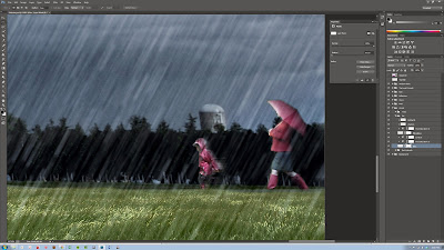
The little girl is just the same except with a motion-blur added to give some 'splashing' movement

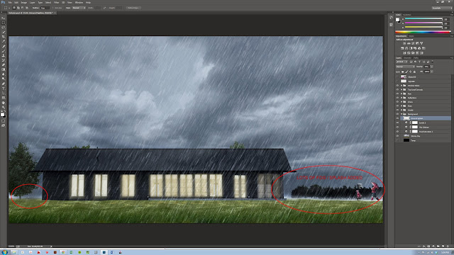
And to really sell it - some 'splash' (or fog if you like....) is added to the horizon line.

Splash

The last step here is to add the final lighting effects.

09. Color Dodge Lighting

This technique comes via the fantastic Pixelflakes folks. Start by making a new layer and change the Blend Mode to Color Dodge. Now use your eyedropper to pick up the Highlight colors already present within your image. Use a soft, low opacity brush to now start 'painting' in highlights, sparkles and color-bleeds through the image as needed.

Color Dodge painted lights
Its a subtle effect once the layer's opacity is turned down but definitely gives the image extra depth and fullness.

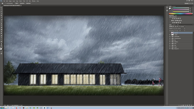
And finally, a simple Vignetting effect to focus the viewer.

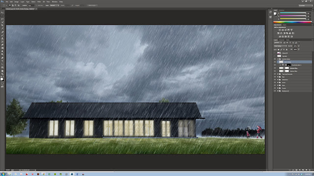
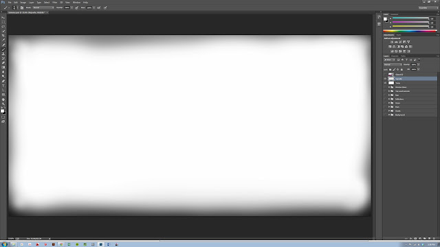
Vignette, use a soft brush to paint the corners and set the layer opacity to a very low value
10. Final

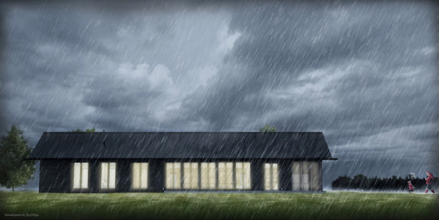
And here's the final composited image. Certainly, much of the colorization and correction here are very subjective effects, but the important thing is the story that the image tells and the lighting is a critical aspect of this. 

Hopefully this breakdown will be helpful to some - and if you have any suggestions or better techniques, feel free to send them our way - we always love to hear new ways of putting these images together.

Final image


Tuesday, October 8, 2013

BLDGtyp does Solar D 2013

DOE Solar Decathlon 2013. Morning Day 2

BLDGtyp recently had the privilege of traveling to sunny Irvine CA to assist the Stevens Institute of Technology team with the installation of their 2013 entry into the U.S. Department of Energy Solar 2013 Decathlon: Ecohabit. We had a fantastic couple weeks of fun out on the west coast with the great group from Stevens and certainly enjoyed working on the amazing house they have been building. Some of you might remember that John and I were the construction managers for the 2011 Parsons / Stevens Solar Decathlon house - so this time around, though we weren't able to assist with the full build over the last year, they asked us to help out with the site-install in LA which we were more than happy to jump in on.

This year, the team was again working with Wolfe House-Movers who executed their ol'-jack-and-slide maneuver to install the home. Their custom jacks never cease to impress me as many times as I see them lift a house up in the air. Always a fun operation too; lifting whole houses up and down and all that.

(Oh - all these great photos were taken by Stevens crew, Esp. Zak - nice work...)

Our man Gareth supervising the house module just after being set - Wolfe uses those big yellow jacks to lift the house and set it gently down on our footings. 
Yours truly setting one of the large roof beams.

The design includes a great covered porch on the East side. You can the see the dramatic roof line here and gang hard at work.
One really interesting thing we got to test out while there was the installation of a new product: the DOW Powerhouse Solar Shingle. A really interesting operation - the shingle is installed with regular roofing nails, almost just like a regular shingle over a special underlayment (a Class A fireproof ceramic fiber based underlayment - rolls out just like tar-paper though). You have to pay attention to your spacing and be a bit gentle with the 'biscuits' (splines which connect one shingle to the next) but otherwise the install is darn straightforward. We were fortunate to have a couple great guys from DOW out to assist us by supervising the install and checking our work throughout but it all went in quite well. I'd be really interested to see how the $/W compares to a traditional system once you take into account the fact that is is also the roofing layer (unlike regular racked Polycrystalline panels)

Installing DOW Powerhouse Solar Shingles. And yes - I'm rocking the full Lawrence-of-Arabia-head-gear there: what can I say, its damn hot in that desert for a guy from Massachusetts!
Just nail where is says and connect one to the next.
  
So a big thanks to the Stevens' team for bringing us out! We certainly enjoyed getting to work with you all and best of luck with the competition - we'll be pulling for you! And a huge congratulations to all the teams competing of course - really inspiring work by all of you. 

Check out the Stevens project (or if your near Irvine - go see it!)


Tuesday, September 3, 2013

Wisconsin "Almost Passive House" One Year On...

South side of the cabin - seen from the woods

John and just got back to New York from a week out at the Wisconsin Cabin and it was AMAZING to see the house again. It weathered its first Wisconsin winter great (not that I ever doubted!) and looks terrific. We were able to button up the last few items that we didn't get to last season - finishing the deck, doing some painting and last bit of trim, commissioning the HRV, etc... - and it was fun to spend a few days road-testing the space.

South deck all finished up

The nice big deck has already seen some serious grill-testing and passed with flying colors. In addition, we were able to get some nice photos of the finished cabin - I'll post some of the interior as well once we have a chance to go through them but I thought I'd put up some shots of the exterior. We're trying to get better at our project photography - something incredibly important that often goes neglected as we rush to finish projects and button things up. the great folks over at Build Blog have written several good posts on the importance of architectural photos which we highly recommend. We're not by a long stretch great photographers, but we're certainly getting better. 

Interestingly, I've found our work on 'fake' architectural visualizations (Renderings) has been very helpful to our photography technique as all the same composition, lighting and story-telling rules apply to both mediums. 

At any rate, it was great fun to see the project again and a nice week to strap the tool-belt on for a little white. Enjoy the photos and I'll post the interiors soon.

South deck built-in benches with the lake in the background

Entry elevation - North side