I thought I'd try something new here and post a detailed 'making of' for one of our newest visualizations we've been working on. Architectural Visualizations are something we spend a lot of time laboring over, and of course every designer has their own (usually very strong) opinions on what techniques are best for these types of drawings. We've been experimenting for a while now with using Vray and Photoshop techniques to get at a fairly 'painter-ly' aesthetic. Hopefully this Photoshop breakdown will be helpful to some and at least a bit interesting.
Here's the final rendering I'll be pulling apart:
 |
| Upstate NY house |
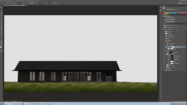
01. Base Render and Color Corrections:
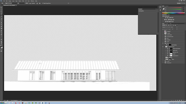
To begin with, I'm going to skip right over the entire 3-D modeling-to-Vray workflow; I'll get back to this in a future post. For now, I'd like to focus on our Photoshop standard box-o-tricks, many of which we deployed here. The initial Rendering was quite low-detail, and very simply lit with a Vray Dome-Light / HDRI in 3D Studio Max. I knew that for this shot I wanted soft, diffuse lighting as I would be adding a rainy Photoshop world in post-production. The home here is in upstate NY and much of the design has to do with providing shelter and protection from the (relatively) harsh climate - so we really wanted to play up this "sanctuary" feeling in the drawing with the lighting, entourage and environmental effects.
 |
| Raw Render - just enough to work with and nothing more |
As you can see, the view chosen was quite straight-on, emphasizing the horizontality of the form and the large wall of windows. We intentionally did not choose a High-Field-of-View, angular, 'Architect-y' vantage point; the project is very simple, restrained and elegant in its form and straight-on shots seem to convey a slightly 'quieter' feeling here.
 |
| Hue-Saturation Adjustment Layer |
As much as possible we of course like to work with Photoshop
Adjustment Layers to maintain as much flexibility as possible. My standard set of initial color corrections is almost always a
Hue-Saturation Adjustment (to reduce saturation and adjust brightness), A
Levels correction (crunch both the black and white) to bump up the contrast, and usually a
Curves slight tweak. These three usually do a great job of 'popping' almost any image. Here, since we're going to do some more dramatic lighting later on, I darkened everything much more than I normally would in straight daylight shot.
 |
| Darken to get ready for the Lights later |
 |
| Level Correction |
 |
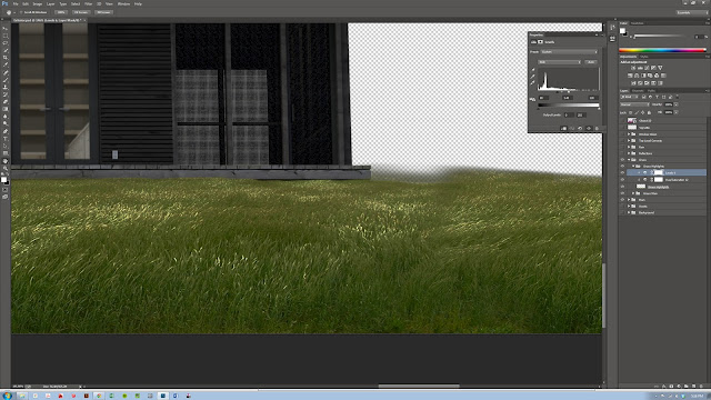
| AO Render Pass |
We used to output a huge bag of Render Passes from 3D Max with every render, but lately we've started being more strategic with our passes - for this simple image the
Ambient Occlusion Pass was pretty much the only one we ended up using for this drawing. This layer is made in Vray and gives a great image which can be used to accentuate surface-contact and give some real weight to forms. If you simply apply a
Multiply Blend-Mode to this layer you'll get great definition on all the edges in the scene. Then simply use the opacity to control how strong the effect is.
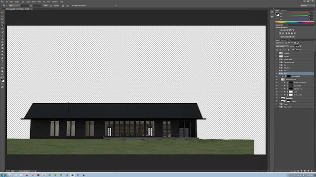 |
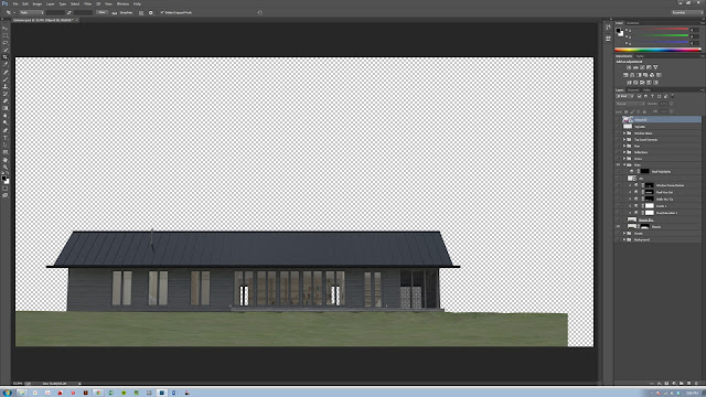
| Final Color Corrected Base Render |
That's pretty much it for the main house. As you can see, most of the real story-telling in the drawing is being done by the non-architecture elements; the environment, the entourage, and especially the lighting.
02. Grass and Foreground
The next step was to begin adding the environment, grass, people, trees, sky, etc. The grass here is from a simple internet search:
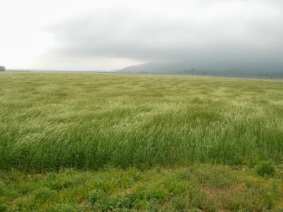 |
| nice clean shot of grass. |
This image was copied, flipped, pinched, prodded and generally-messed-with until I got a nice fully-grassy site for our house.
 |
| Grass Foreground Layer |
The grass, however, needs to look wet since we're going to add a rain effect later. To do this I duplicated the grass layer, and added two adjustment layers to get the highlights to pop: a
De-Saturation to get a totally grey-scale image, and then a simple
Level adjustment to really bring out the highlights. This method gives a very nice shiny-tip effect which worked well to give us the 'wet' effect.
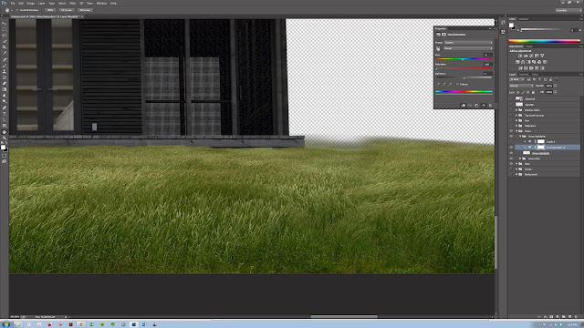 |
| Duplicate the layer and make B/W with the Saturation Adjustment Layer |
 |
| Add a Level correction to pop those highlights to give the shiny, wet effect we're after |
 |
| Grass Hue/Saturation Adjustment |
And finally, a
Hue-Saturation adjustment to correct the overall lighting level and bring it in line with our house.
03. Background:
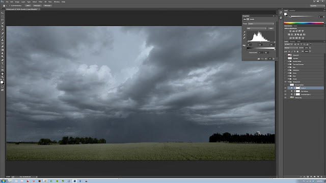
Next, the background was dropped in. Again, an internet search for images revealed lots of great images, but we chose this dramatic cloudy sky over a field:
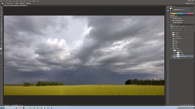 |
| Original background image, cropped |
Aside from the usual color corrections, the main element here is the use of the '
Colorize' function within the
Hue-Saturation adjustment layer. This adds a consistent hue adjustment to the entire image and can be used to add uniformity to the colors in an image. Typically, I like to add this adjustment and then reduce the adjustment layer's opacity in order to temper the effect. Here we gave everything a nice blue pall to give us a nighttime look that will work well with the rainy, cold feeling we're after.
 |
| Colorize using Hue-Saturation Adjustment Layer |
 |
| Levels Correction |
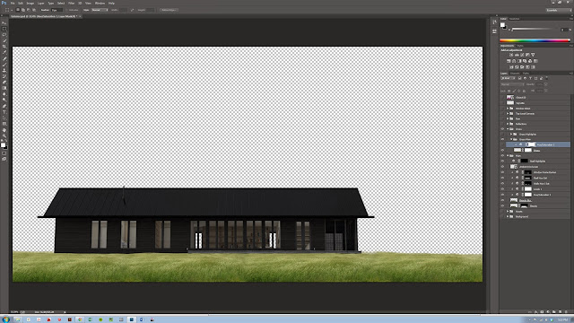
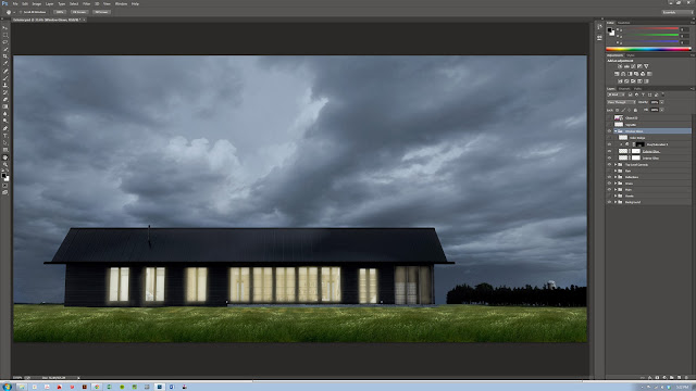
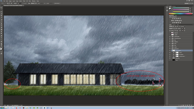
As you can see below, the final composite looks very dark, but that is intentional so that we can add in the lighting later. You can also see that the colors (the green, the yellow and the slate sky) are NOT working well together. We'll fix this in the next steps.
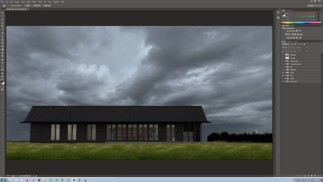 |
| Final Foreground, Background and House composite |
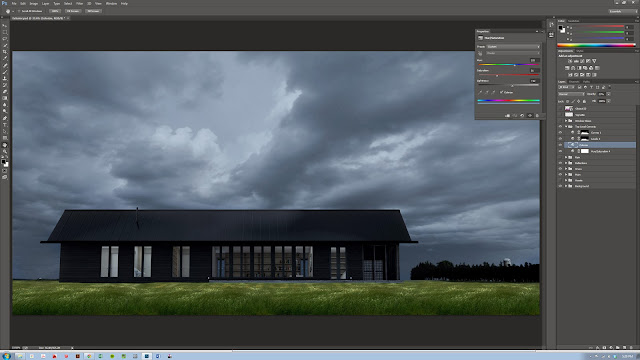
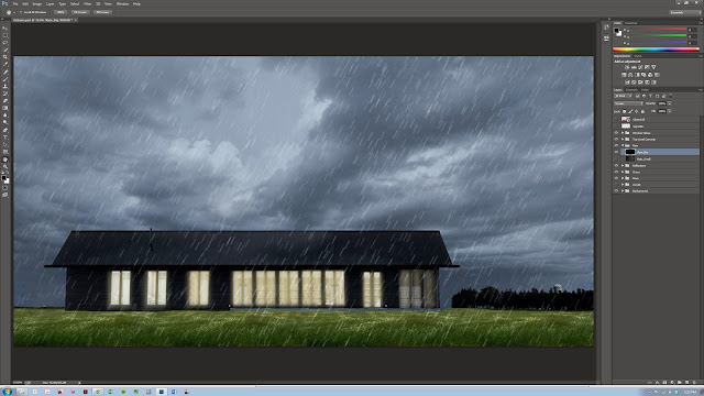
04-05-06 Reflections, Top-Level Color Corrections, Glows:
Here we added some painted on reflections (just bright splotches) to the grass, and more importantly we add a
Hue-Saturation Colorization which affects the entire image file. As you can see, the Hue adjustment gives a strong cooling effect to the image - this layer is only at about 25% as well to make sure that some of the original hues come through in the grass, but still giving us a more uniform hue range.
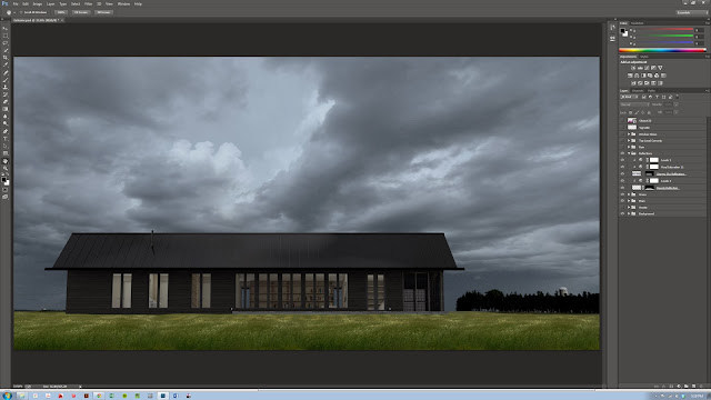 |
| 04. Add painted reflections to the grass |
 |
| 05. Colorize to unify all the various colors a bit |
Here we also add a series of drawn-in glows for the windows. These effects might seem a bit harsh here but you'll see that behind the screen of rain we're going to add next they have to be pretty strong in order to show through well.
 |
| 06. Painted on Window Glows |
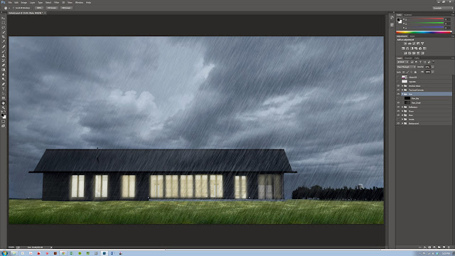
07. Rain:
The rain effect was added entirely inside Photoshop and in two layers. The rain is done in two distinct layers with different size rain-drops in order to give some depth the scene. There are LOTS of great tutorials on how to produce this effect so I won't bore you with it again here. If you want to see a great tutorial on this, check out
PSDTUTS here.
 |
| Rain Drops - Large |
 |
| Rain Drops - Small |
 |
| Rain Drops - Combined |
08. Entourage:
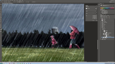
Entourage is the name an old firm I worked for used to give to people, trees, foreground elements and other misc 'life' in scenes and it seems to have stuck in my rendering vocabulary. The scene here includes only a very few elements - just enough to establish the story and give some sense of depth to the world being illustrated.
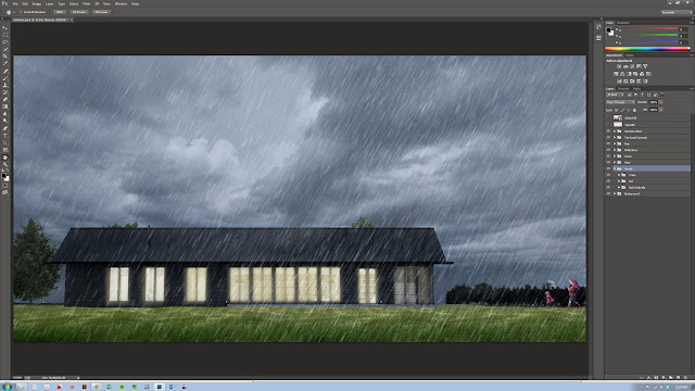 |
| Trees and People |
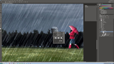
The most important part here are the people of course. The mom (grandmom?) in her jaunty red raincoat here is perfect. This rendering is fairly low-res as its destined to web-only viewing so I didn't spend a lot of time messing with high-res people. Its important to be strategic with these images - no sense in wasting time unnecessarily after all. The lady here is another internet grab with shadow and highlights painted to correct the lighting:
 |
| Initial image added to the scene |
 |
For small elements like this I just paint a quick image mask
rather than using the path tool to carefully trace. |
 |
| Masked image |
 |
Next, to correct the lighting direction: shadows are
painted in on a separate layer with a soft brush. |
 |
Same thing for the new highlights. On a small element like this
you can quickly change the lighting direction pretty easily |
 |
And finally: a de-saturation to make the element's coloration match the image pallet.
The little girl is just the same except with a motion-blur added to give some 'splashing' movement |
And to really sell it - some 'splash' (or fog if you like....) is added to the horizon line.
 |
| Splash |
The last step here is to add the final lighting effects.
09. Color Dodge Lighting
This technique comes via the fantastic
Pixelflakes folks. Start by making a new layer and change the
Blend Mode to
Color Dodge. Now use your eyedropper to pick up the Highlight colors already present within your image. Use a soft, low opacity brush to now start 'painting' in highlights, sparkles and color-bleeds through the image as needed.
 |
| Color Dodge painted lights |
Its a subtle effect once the layer's opacity is turned down but definitely gives the image extra depth and fullness.
And finally, a simple Vignetting effect to focus the viewer.
 |
| Vignette, use a soft brush to paint the corners and set the layer opacity to a very low value |
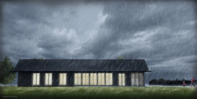
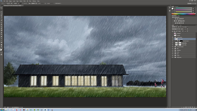
10. FinalAnd here's the final composited image. Certainly, much of the colorization and correction here are very subjective effects, but the important thing is the story that the image tells and the lighting is a critical aspect of this.
Hopefully this breakdown will be helpful to some - and if you have any suggestions or better techniques, feel free to send them our way - we always love to hear new ways of putting these images together.
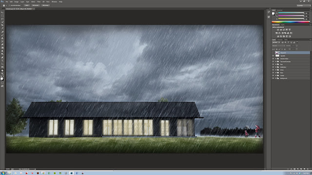 |
| Final image |


.JPG)